
By Clive Belfield
On September 12, the U.S. Department of Education released a trove of college-level data on completion, debt, and earnings. Instead of ranking colleges, the Department has essentially said, “Here's information on colleges. Use it how you wish.”
There is already a lot of evidence on the economic benefits for students who attend community college (Bailey & Belfield, 2011). There is also a lot of evidence that, although colleges matter, student characteristics and program characteristics matter much more. And we know that community college students who transfer to four-year colleges can get significant labor market gains.
But some of these new Scorecard data have not been available before, and on some dimensions, they are more complete than previously available data. In light of these new data, how do the previous conclusions about the labor market returns to community colleges hold up, and what are we learning that is new?
The most novel information is earnings data from tax records—this is the first time we’ve had it for colleges across the nation. No data are perfect, but this is good-quality data. Aggregated to the college level, earnings are the sum of reported W2s and self-employment income of undergraduates 10 years after their first enrollment. The data capture all students who started at the college and who initially received financial aid. This is helpful—colleges can see how all their students performed, not just those who completed a degree or certificate program; and it is tax data, so it includes all earnings (with little measurement error). The restriction to only students who received financial aid excludes about 40% of all students. But overall, financial aid students are not so different from the typical community college student. (They come from somewhat lower family incomes but are more likely to enroll full-time.)
There will likely be much more analysis with these data. But here is a first pass for community colleges.
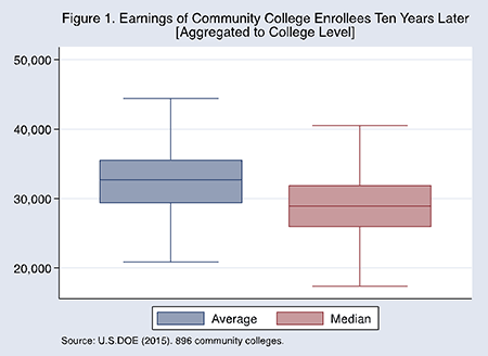
There are differences in average earnings by college. Figure 1 shows the box-whisker plot for average and median earnings for 896 community colleges across the U.S. The line in the box shows the earnings of students 10 years after first enrollment aggregated to the level of the college; the aggregation is either at the mean or median earnings. So, the mean college-level earnings are $32,700 (the median is lower at $29,100). By comparison, mean earnings per similarly aged high school graduate are $26,500, according to census data. So, the returns to community college still look substantial.
But in Figure 1, the boxes show the middle 50% of colleges; the whiskers show the 10th and 90th percentiles of colleges. The spread is quite broad. Attending a "top 10%" community college would lead to average earnings more than $12,000 per year higher than attending a "bottom 10%" community college.
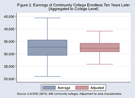
However, the findings in Figure 1 are raw college-level averages. They do not adjust for any characteristics that might be outside the college's control. So in Figure 2 is the same box-whisker plot after adjustments are made for area characteristics—ethnic/racial demographics, the percentage of college-educated persons, and the unemployment rate where the college is located. There are almost certainly more sophisticated ways to make these adjustments, so we emphasize that Figure 2 is illustrative. Nevertheless, when we control for where the college is located, the spread in earnings across colleges is much smaller.
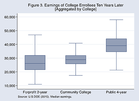
There are overlaps in performance between community colleges and other colleges. These (unadjusted) overlaps are shown in Figure 3. Median earnings per community college are significantly above those at for-profit two-year institutions, although the variability in the for-profit sector is very wide. Median earnings at community colleges are significantly below those of four-year colleges, but the top 25% of community colleges have median earnings that exceed the average four-year public college. The overlap between these sectors is quite broad. Moreover, given the adjustments illustrated in Figure 2, it is likely that this overlap is bigger than is shown in Figure 3.
Lastly, it is the right decision not to use these data for ranking community colleges. Ranking works best when alternative, plausible measures of performance give the same rank. But here's a nice tidbit from the dataset: What is the correlation between the college completion rate and the earnings measure for two-year colleges? It is 0.07. Almost zero. In fact, for colleges with graduation rates below 50%, it is zero. Choose a college based on its completion rate ranking, or choose one based on its earnings ranking. It almost certainly won't be the same college, making it clear that rankings based on these two metrics would be very misleading.
There are many new things to learn about community colleges from these data. For now, we conclude: The returns to college are still clearly positive; there is some college-level variation, but we don't know how much; and most community colleges perform significantly better than for-profit two-year colleges, and the best of them can match the earnings of public four-year colleges.